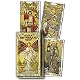
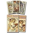
Golden Art Nouveau Tarot (Golden Art Nouveau Tarot, 1)


S**K
Gorgeous work of art.
A beautifully rendered Tarot deck. Gorgeous.
Y**.
Beautiful cards
Beautiful deck, shuffle like a dream.
A**R
Just what I wanted
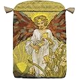
These small cards are just right to travel with me. I love the illustrations. Similar symbols to Rider-Waite, but in a style I adore. Cute little box. Multi-lingual simple introduction booklet. Cards are only numbered, so study up. No gold, but great for the price!
B**Y
My favorite
Very pretty cards.
L**L
Purchased it as a gift. Loved the artwork, aesthetic and quality so much I got one, too.
I was looking for a deck that didn't use Pamela Coleman's artwork but still stayed true to the original RW style deck and this checks off all the boxes.I wanted a RW deck but one that was a little bit more illustrated in its artwork. The gold foil is a bonus - I thought it was going to be tacky at first but it's very tasteful. The artwork, especially on the sword suite, is very approachable. I purchased this initially as a gift for a beginner tarot reader and figured they would be scared of the sword suit. While this deck is still true to the original imagery, it's softer and more inviting to read.Cardstock is great and shuffles well. The deck is slimmer, so its easier to shuffle in smaller hands. If you're familiar with the Ancient Italian tarot deck it's literally the same dimensions as that. Feels sleek and isn't as cumbersome as the massive "boxy style" dimensions you'd find in other decks.Only down side is that you can tell what cards are reversed and what cards are upright due to the card backs not being perfectly symmetrical. Doesn't bother me so much as I draw cards without looking, but I figure this is important to mention.Great for readings for people unaquanted to tarot as again, the imagery of some traditionally known, "scary" cards can be off-putting, but this deck is inviting all around. Something important to note if you do readings for other people - just thought I'd mention that here.
L**R
Beautiful.
Beautifully done, these were great for crafting.
C**R
Best Four-Star Deck I Have Seen
Tarot is art, but it is a particular kind of art intended to be experienced in a unique manner. The star rating system doesn’t always work with Tarot decks, and this is the case here.First, I was very pleased with the quality. Lo Scarabeo certainly has their “golden” technique down. I have never been disappointed with that. Here, the patterned gold is applied more or less, depending on the card. Sometimes, as in Temperance XVII it is just a filigree against a color background. Usually, the slightly textured design is gold-on-gold. The light hits these in such a way there is usually no difficulty seeing the intricate design. The varying use of gold among cards seems well chosen for the designs. Compared to, say, their Golden Marseille deck, the use of gold is much more restrained and less of a distraction.The artwork is top-notch, both faithful to the original Rider-Waite-Smith imagery while exhibiting the particular style and skill of the artist. Unlike so many decks that are ruined by a clunker or two, every single card catches the right note. The illustrations are more realistic than the storybook style of Pixie Smith, with many figures bearing distinctive “portrait-like” faces. There is a lot of feeling in each card, and the scenes are energetic where appropriate. I don’t have much to say about the cards individually because they are all, again, very well done, each a little masterpiece that still fits into the deck as a whole.The lack of multilingual card titles is most welcome. In fact, there are no titles at all. This should not pose a problem for anyone familiar with Tarot (or willing to make the minimal investment in getting to know her).As for being “Art Nouveau,” I think it’s close enough. The intricate Golden filigree recalls Oswald Wirth’s border design in a distant fashion. The sinuous border designs have the style, too. The illustrations themselves are not particularly Art Nouveau, other than the appropriately muted colors, but the deck does capture the flavor. In fact, it’s nicer than other Art Nouveau decks, surpassed only by the Golden Tarot of Oswald Wirth, the one with just the Trumps. NOT the complete “Wirth“ deck with those awful pips. (A new complete Wirth deck is due out in June 2021, with pips based on some “restored tetrad” theory. Unfortunately, for some reason none of the pip cards have been revealed as of writing, so we’ll just have to wait.)So, the sting is in the tail, as the saying goes. Why would I ding this gorgeous, faithful interpretation of The English Deck a star?It’s not because of the box. I don’t take stars off book reviews because I don’t like the dust jacket either. If you’re going to keep a deck for use, there are good reasons to get a new box for it. Sturdy custom telescoping boxes can be found for twenty bucks and custom wooden ones for twice that. (I prefer the former, though, with a silk-lined bag to prevent scuffs.) I also don’t take into account LBWs. They’re expected, and can be not too awful if that’s all you have, but I pitch them as soon as I open a new deck.The real answer can be seen in comparing this deck, the original RWS, and the Conver Ben-Dov Tarot de Marseille. It can also be seen in the picture of the Tower XVI on display in my Catch of the Day stand.Up close, appreciating the details of the Tower, it is indeed gorgeous. But in a spread, or on display, those very details can interfere with the peculiar art Tarot represents. The same could be said about many the cards in this deck. Add that lovely gold, and now a reading can become more difficult. Reading by the Table in typical English positional spreads (such as the famous Celtic Cross) probably isn’t going to pose much of a problem. But try reading by Image in a more open way (which is usually not done with the English Deck anyway) and it can get visually muddled. Interfere with flow.The second issue may be subjective, but the classic decks have a reason for depicting figures in a way that you probably would not recognize them if you passed them on the street. I find The Empress III, for example, a bit distracting. I would recognize her if I ran into her at the grocery store. Some cards are so portrait-like, they are in danger of losing that traditional archetypal quality that seems to me to have very sound reasons behind it. (Add the English tradition of forward-facing figures looking you in the eye and the issue is magnified.)Related is the careful anatomical detail of the nudes. Obviously, there is a long tradition of nudity: Le Diable XV is quite crude in the Tarot de Marseille. Nudity can be symbolic. And there is nothing prurient here. The illustrations are tasteful. Yet, when the Star XVII woman looks like a particular woman rendered as a detailed, naturalistic nude, I find that distracting for the same reason the very distinctive features of the Page of Wands, for example, are distracting. I prefer to be looking at “a” person, not “that particular” person, if you know what I mean. But you see that that a lot in decks. Maybe I’ll get used to it, because I do admire the deck very much.Neither of these two objections reflect badly on the deck or its artist. In fact, these are some of my very favorite illustrations from a non-reading perspective. If you, dear reader, disagree with my prejudices, please feel free to add an extra star to my review!In closing, this is a gorgeous deck with effective and tasteful application of “gold” with a decidedly Art Nouveau vibe. I am very happy to own it, and it is worth its own custom box in my collection. I particularly like how the artist has remained faithful to the original RWS artwork even while expressing it in her own, different style. I admire that sort of respect among artists, found so seldom these days.
Trustpilot
3 weeks ago
1 week ago