🖊️ Write Your Legacy with Monteverde Ink!
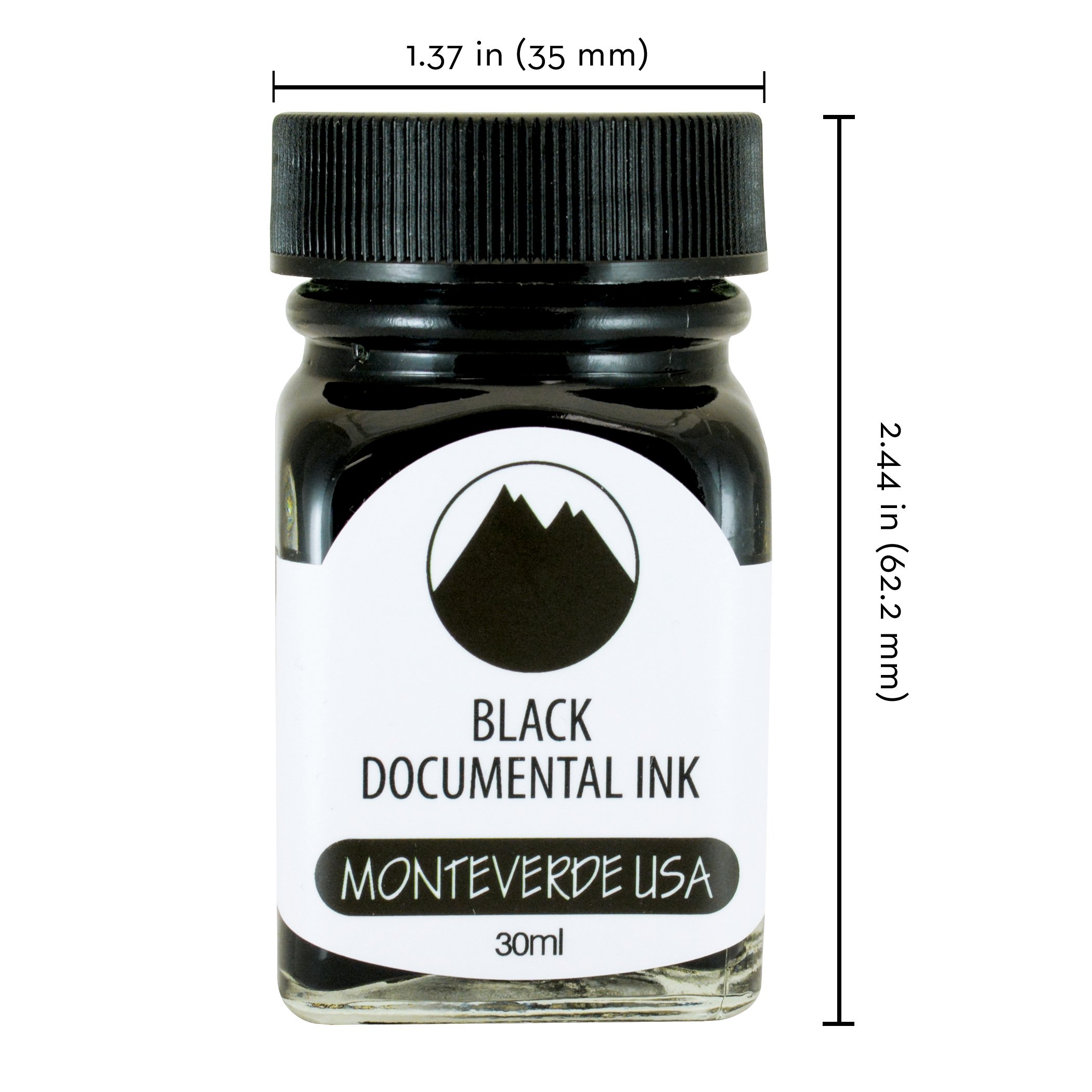
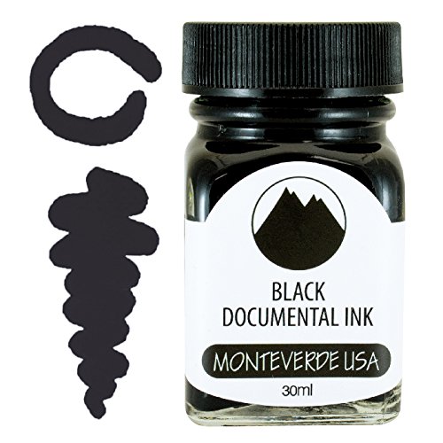
Monteverde USA Ink offers a 30 ml bottle of Documental Permanent Black ink, featuring an advanced European ink treatment formula that enhances ink flow, extends cap-off time, and protects against corrosion, making it ideal for both vibrant creativity and professional documentation.
J**A
Very pretty, a bit light
A gorgeous ink. It does dry a bit lighter than the label, but not too much to be unrecognizable.
A**R
Makes fine nibs medium
I used this with a Montblanc pen and Schaefer pen. Both pens have fine nibs. The ink made a thicker line, more like a medium nib, particularly in my Montblanc pen. This made the ink ghost through to the back of the page. I have been using private reserve tanzanite ink as well as Montblanc royal blue ink and didn’t have that problem before. Also, the color was a bit disappointing. I read one review where the color was compared to private reserve tanzanite, it is definitely dark purple, so dark that even on white paper it’s hard to see that it’s even purple. When it comes to the gemstone Sapphire, it’s nothing like that color. I do have to say that the lubrication in the ink does make smooth writing. If you have an extra fine nib and you don’t like the way it feels when writing then this is your ink. Also, it’s waterproof as my hands will attest.
J**E
Raven Noir ink has excellent behavior attributes and attractive presentation
When it comes to fountain pens, the ultimate ink for me is black, and the paper white, for classic clarity of my writing. Some think black ink is boring, and that black ink is black ink. They're quite wrong. Appreciation of the variety in black inks requires a much more discerning eye that can detect the nuances of each ink. Granted, it's not one of the glittery shimmery inks (although there are blackish inks available with glittery flecks), nor is it a flashy color. It's rock solid classic black. It stands tall on the page. It makes a statement.Raven Noir is my first Monteverde ink, and my twenty-third black ink. Yep, 23rd. I have been writing with fountain pens for quite a while. I have extensive samples of them all, on various paper, and using pens with various nib widths. For comparison and consistency, I use a 6mm poster nib on a dip pen, so I can readily examine the qualities of each ink, on HP Premium 32 lb. paper, and usually samples also on the exceptional Rhodia, Calirefontaine and Tomoe River papers.Now, ravens are my favorite bird, and I love watching them. Noir is my favorite film genre, and I love watching them. How could I pass up an in called Raven Noir? Yep, I bought it based on its name. I stayed for its beauty and performance. It has become one of my favorite inks.I use mostly broad, stub and italic nibs. Most of my writing with this ink has been on a broad #6 nib. It's a wet one, and shows off whatever ink is running down it. The ink itself is medium to dry. Monteverde inks contain lubricants, and it flowed flawlessly for me. There is no shading. There is only the slightest sheen, and only on the Tomoe River paper. It won't be noticeable in most cases. The drying time was impressive for such a wet broad nib: 7 seconds on HP Premium 32 lb, 20 seconds on Rhodia 21.3 lb, and 60 seconds on Tomoe River. I have not experienced smearing or smudging. Raven Noir feathers on copier paper, moderate feathering on HP Premium 32 lb, but no feathering on Rhodia or Tomoe River. Monteverde claims that the lubricants make for extended cap-off time, and it's true. I don't have to worry about taking a little time before I start writing again. The writing performance was very satisfactory; the kind of ink that makes you want to just keep writing and writing.How does it stack up against my other 22 black inks? In terms of blackness, it's in the top seven or so. It's not as black black as the infamous black blacks, such as Noodler's Heart of Darkness, Noodler's Black, or DeAtramentis Document Black. In terms of how opaque it is, it's somewhere in the middle of the pack. There is a very slight purplish tint, and chromatography showed a fascinating and complex layering of colors: green, blue, blue-gray, brown and even a pink.I love this ink, and that says a lot, as I'm quite picky about my inks. It will stay in my black ink rotation. I'll also be checking out more Monteverde inks.
R**T
A good ink!
A very good permanent black ink. I wish it was just a bit darker as I like a very dark black line. But very fine ink all around!
A**Y
Beautiful
A beautiful rich emerald green.
M**L
Pretty Thick Ink.
The color is nice, but the ink is very thick and my bottle when using the ink there is sometimes a string of ink that goes from the paper to the nib when I lift the pen. This is only when looking up close. It doesn’t feather much which is nice. But I have had flow issues with pens after I use this ink which makes me kind of hesitant to keep using it. But it’s a great price. I don’t know if I got a weird bottle or if all are like this.
D**.
Red like a Ruby when dry
This is a wet ink, meaning it flows easier than most other inks, puts down more ink than "dry" inks, draws a thicker line, will take a bit longer (a few seconds) to dry, and has an easier time bleeding on cheap paper.This is RED, like red nail polish red. Deeper (not darker) red than coke can red, but not shiny. I want a sports car painted with this red; the pictures don't get the shade right. I really like this shade of red, most other reds are darker towards maroon or lighter towards pink. This writes in intense red and it stays the same color red when it dries. I cannot say enough good things about this red!My normal ink is Pelikan 4001 Royal Blue which is a dry ink. As soon as I switched to Ruby Red, i noticed right away that the ink flowed faster. My EF nib lets me write on cheap paper; with the Pelikan ink that was true, with this Monteverde Ruby Red ink, I can still write on cheap paper but it writes like a FINE nib. My EF thin lines are definitely thicker. Paper is good enough that is still isn't bleeding but I've got concerns using this with a medium nib pen would be too much for the cheap paper I use (generic A5 spiral dotted notebook w/ 100gsm paper, about $5-6 on amazon). Your experience may vary depending how cheap you went on paper :)On my monitor, the pictures of Ruby Red seems a bit orangish (same for google image searches for this ink) almost looking like a mango orange. There is definitely no orange when writing w/ a FP. A cartridge rollerball like the Herbin is lighter shade of the same red simply because its so stingy with the amount it puts down. The Frixion red leaning towards a pinkish hue, the rollerball is red but not as intense, and the FP red is intense. This is a deep red, not a dark red. Think candy apple red, without the shine. Think the color of a crayola red crayon (the actual crayon, not the color it makes on the paper).Like I said, I want a sports car in this color...
K**L
Best ink for my Esterbrook fountain pen.
This is the only ink I have tried that actually works beautifully with my new Esterbrook Estie fountain pen. It flows well and is not too light a color, but just perfect. Beautiful shade of sepia.
S**R
Kinda faded
Attached is a photo of the Blue Documental ink on regular copy paper, in natural lighting indoors. The color does change quite a bit depending on the thickness of your nib. I found the F to be too light. It is waterproof though!
A**R
Beautiful ink colour
Expensive ink, but is really quite pretty to write with.
I**S
Excelente producto
Me gustó mucho la tinta, la use en la pluma Jinhao y da una buena fluidez
W**W
Wrong Ink inside the correct bottle
This is more of a PSA than a review. I believe that this is a different colour to pink. I ordered the first bottle 13/01/21 and received a replacement on the 14th, before reporting this problem to Amazon for them to check.TL;DR: If it's a pastel-esque pink then you're fine, however, if it's more of a purple, chances are it's a different colour.There isn't a proper reason why this link is bad, rather, I believe that the ink is wrong!When I first opened the bottle, impressions were decent. The bottle came sealed in some shrink-wrap and in a clear box. However, with the first look at the colour through the bottle, it looked too dark to be pink.I have tried many different colours of ink, and while someone who isn't too picky about colours could argue that this is a very dark shade of pink. I would say NO.You can see another comment about this ink saying it's a horrible brown colour. I believe that I have the same ink, however, I don't think that it's a horrible colour. It has a very close resemblance to the Iroshizuku Yama-budo, more of a purple colour, but without the sheen. Looking closer, although you might not be able to tell with the photo, this ink is somewhat cooler than the Yama-budo. I have uploaded a photo to show the comparison on Tomoe river paper (although they are in different pens).[If you still think that this is a pink colour, Iroshizuku also do a pink and it's called Kosumosu - there is a stark difference between the two. I have also given a comparison to the Sailor Manyo ink, Sakura, which is more of an orange colour. Although this is more of an orange, the saturation should be similar. The photo should be used as a comparison but isn't what it looks like in person, for example, the Sakura looks more pastel-orange rather than neon, and I attempted to take a photo which would show the bottle, leaflet, writing and also to get the Yama-budo without much sheen, as TR paper is really a shading and sheening monster and photos further accentuate that.]I would make the assumption that this is the purple ink but just inserted in the wrong bottle, as this colour also matches the purple sample on their little leaflet in the box. Looking online, the proper colour is supposed to be a really light pink colour. This is a shame, as I really did want that colour, but I am unsure if the colour is right now.I have contacted Amazon about this, and they said that this was under review after providing me with a refund. I would have left it like that, and not written a review, but I am not sure if they have realised the problem and fixed it as it is quite subtle - the bottle and packaging say Rose Pink although the ink isn't and one would need testing of the ink and familiarity of the colours to make the correct judgement.As ink, however, I am satisfied with the way it flows and performs. It is indeed more of a mature colour and is easy on my eyes. The performance of inks vary between colours, not just brands, and as this ink is different, the performance of the proper pink could be different.So overall, good ink but wrong colour. The problem should be fixed by now, but if it isn't, I would probably suggest contacting Amazon, as they are the ones who are selling it. If you receive the correct light pink colour, then this review is not applicable and you should ignore it.I have put a low rating to draw attention to readers, but honestly, I believe this is somewhat unfair and would have liked to make some sort of PSA instead, but that wasn't possible.
興**津
色とにじみ
ヌラヌラ感があり、書き心地はよくなる。一方でモンテベルデがITFと呼ぶ技術によりインクフローもよい。しかし肝心の色(ブルーブラック)がほぼグレーで、青味をあまり感じない。そして他のインクに比べてにじみが気になる。残念。
Trustpilot
2 months ago
3 days ago